There was a similar outcry of disbelief over, what I am choosing to call, the link. I am here menulis this to gather everyone's collective panic and misgivings into one place, as well as to try and look at the positives of these baru saja changes, in an attempt to placate some of your fears.
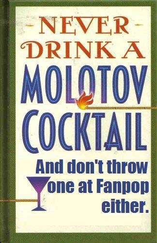
First of all, let's get the obvious out of the way. AH! OMIGAWD! fanpop LOOKS WEIRD AND IS ALL DIFFERENT! It's like facebook and YouTube had a baby and named it Fanpop! It's FaceFanpopTube! Danger Will Robinson Danger! FREAKING OUT! PANIC ATTACK! TROWING MOLOTOV COCKTAILS INTO fanpop HEADQUARTERS!
*Hyperventilates.*
*Calms down.*
OK. There. Some of anda may still need a paper bag to breathe into, so go get one and then finish membaca this artikel because now I'm going to try and address these new changes in a rational way, and try to be as impartial as possible.
First of all, yes, the above was (somewhat) close to my first reaction to the changes. DarkSarcasm can attest to that. Not that I would ever consider throwing Molotov cocktails into the fanpop office, because that's blasphemous... But still, it captured my sentiments. So I do empathize with everyone who is freaking out and has automatically decided to hate all the changes. I want to hate all the changes. I fear change. Change is scary. I was afraid of the new ratings system four months ago, but I've swallowed my pride and, for the most part accepted it. From past experiences, I have a feeling that four months from now, people will be used to these changes, as drastic as they are.
detik of all, let's just remind ourselves that fanpop is a labor of love. It was made for the fan and for the community. And running any sort of society, even a simple online community, can be tough and decisions will be made that will not be populer with every member of that community. So my hat off to the great fanpop Four, who do their best to make fanpop as awesome as possible for the rest of us. They did not change fanpop to ruin your online life. They did it to try and make it better.
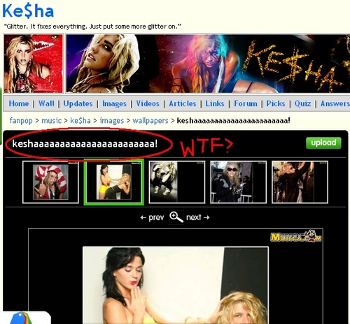
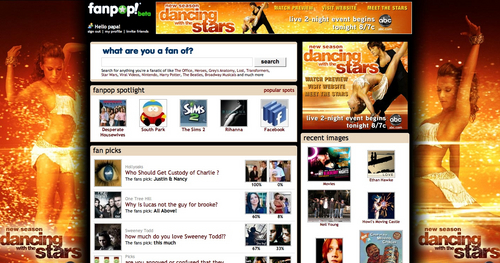
Let's look at some of the new features, OK? Like the new walls that exist on spots and profiles. A komentar wall, such as those on facebook and MySpace, has been suggested oleh users in the past (link). And, based on that example, lebih people berkata they would LIKE a komentar dinding than WOULDN'T like it. So anda can't say that this wasn't in demand.
Also, let's think about the benefits of the komentar dinding for a minute. Several of us, mostly the grumpy old fogey users, complain about how jawaban is used to make link. I can only hope that this dinding feature will eliminate the need to abuse the jawaban feature as much. Secondly, it may stop acak and/or pointless props, and perhaps get rid of that dreaded holiday "props day!". So those are two things the dinding could be good for.
So the komentar dinding seems like not a bad idea, right? atau at least not as bad as anda first presumed. Hopefully.
One qualm I do have is all this clutter. I kind of wish the boxes were organized in a different order, so that I could put my own komentar dinding on the bottom of my page, atau maybe disable it alltogether. The option to enable atau disable your personal komentar dinding should be provided. That's my first critical suggestion about the new lay out. Keep in mind that for a komentar to be "critical" it should mention something that could be improved, and suggestions for how that could be done. "This sucks" atau "Fanpop is Fail" are not examples of critical comments. They're just complaints. But complaints have their place in a public forum as well.
Thinking critically about these changes, I'm wondering why certain categories (like gambar and videos) were grouped together. If anda want to group things together under tabs like that, why not put them all (images, videos, answers, forums, picks and questions) all in ONE box with several tabs? Also, where are the links? They seem difficult to find. Should they be paired with the artikel section? Perhaps if these things took up less space, it would feel less cluttered. Somehow, it feels lebih cluttered than the layout before it. These are just some critical notes I've made.
Back to the positive! (Compliment sandwich yay!) This new layout provides opportunities for luar angkasa saving. And yes, I know I JUST berkata it feels cluttered, but hear me out. The tabs are actually kind of helpful. I think they categorize content fairly well.
Also, not everyone is upset about the new change. Some people are excited about it:
"I really like how the spots look. The update section took up too much unneeded luar angkasa at the puncak, atas of the page, so i like that they moved it to the right and made it smaller. I like that gambar are on puncak, atas because that's the first place I always look and i like the condensed picks/links/articles." - link
Others accept the change with a grain of salt, realizing it's not the end of the world:
"I guess we'll get used to it. Just hope people will use this dinding function for decent things, not spamming and bashing." - link
"Actually, it might not be that bad. At first glance, it seemed aweful, but maybe it's the type of thing that just takes a bit to get used to, then anda cinta it." - link
Still others have jumped right into the new features with reckless abandon (and I do mean RECKLESS):
"Team Rosalie For Life! =D" - link
My best saran to those of anda with less-than positive attitudes about the change is this: Try and be flexible. anda may not like it immediately, but give it a chance to grow on you. In a month, anda might not even remember what anda were so upset about.
A few other suggestions I've heard/seen.
"[The fanpop 4] could have doubled [links] up with the artikel like [they] did with gambar /videos and jawaban /forums and picks/quizzes." - link
"Wall posts should have a laporan button..." - link
"I don't exactly like the new profil layout... with the dinding & everything because it's totally uneven, the right side is way longer...they need another section on the left. My only other problem with the dinding is that the text is too big... but other than that i really like the new additions/style" - link
A personal suggestion from Yours Truly would be to allow users to use the "old version" of Fanpop, at least until they are ready to accept the new version. I am not an HTML wizard, atau adept at running a website, so if this is too difficult to do, then apologies. I only know that this is what some websites and programs do to help sooth the savage fan beast - I mean, base. I know when facebook transitions, it does that. Then again, a lot of people are complaining that it's too much like Facebook, so maybe that would be kind of paradoxical. But whatever.
Actually, just menulis this artikel has helped me, personally, calm down a lot about the changes. I no longer need my paper bag. I'm coping. I'm moving on. I hope a lot of anda are calmer now, too, and maybe even looking at these changes lebih positively. Have a great rest of the week everybody and link because I hear that only TWO PEOPLE have voted. So get your butts in gear! </FGT plug>.


The My update feature received a major overhaul during the last few weeks. I'll provide a quick run down of how it works and what it can do for you.
Where Can I Find It?
My update can be found on your user profil page if once anda are logged in. If anda have updates, it should be the first module on the right hand side of your page. If anda don't have any updates, then the module doesn't tampil up - but anda can always go to My update from the bottom right link in the About Me module on the puncak, atas left of your profil page.
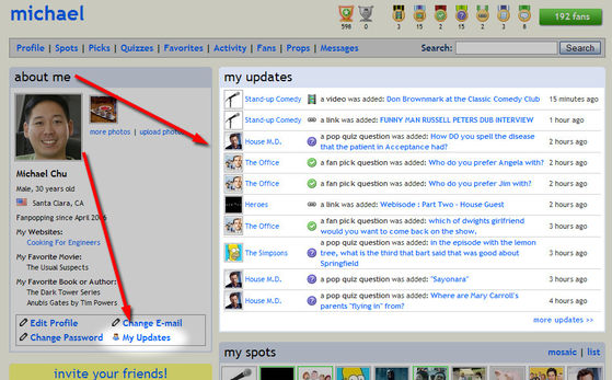
What Does It Do?
My update shows anda when content has been added to the...
continue reading...
Where Can I Find It?
My update can be found on your user profil page if once anda are logged in. If anda have updates, it should be the first module on the right hand side of your page. If anda don't have any updates, then the module doesn't tampil up - but anda can always go to My update from the bottom right link in the About Me module on the puncak, atas left of your profil page.
What Does It Do?
My update shows anda when content has been added to the...