A cover on a comic book is typically the first thing a reader will see, the first thing to engage the reader. The cover must draw in the reader's interest, be something eye-catching enough to grab your attention, but good enough to hold it. Typically, the cover will feature characters in the comic. The older covers will usually depict a scene from the books, but in lebih baru saja years, the covers have become lebih vague. In lebih baru saja years, the idea has been lebih of the "show the readers enough of what is within the pages to draw them in, but not give enough away to ruin any surprises...or disappointments" variety.
This has led to a variety of covers, some being very good while others are horrendous. It has also allowed for the "variant covers" to take rise. Variant covers are...honestly, they're just a cash grab. The material contained within is the same, but just encased in a different skin. Everyone knows what it is, but people still cinta it. Sometimes the variant covers are better than the main, widely circulated cover. To tampil examples of this, I wanted to rank all of the covers for Jean Grey #1 from least to best.
Please note : These are the covers as listed oleh Marvel Wiki as official covers for Jean Grey #1 and available for purchase on Midtown Comics' website. If there are others, I apologize for not including them.
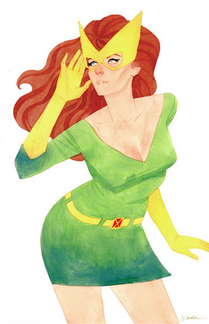
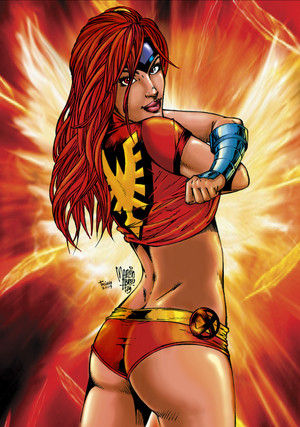
#7 - Millie The Phoenix Variant Cover -- Artist : David Williams
There is not one of the covers on this daftar that I don't like. That said, there are definitely some I like better than others.
While a cute cover, and a nice homage to Millie the Model, this doesn't scream Jean Grey to me. I know, I know, it's supposed to be an extra variant cover. However, if I were to have seen this one in the store selanjutnya to the others on the shelf, while it would have caught my eye with the retro paper doll aspect of it, I wouldn't have picked it up. Instead, I would have picked up any of the others selanjutnya to it which is clearly a Jean Grey comic.
That said, I do like how close of a homage this is to Millie, as seen with the comparison picture here. The Phoenix cover made sure to include a paper jaket for Millie to wear, as well as a short dress and two "longer" garments.

Jean Grey #1 - "Millie the Phoenix" Variant Cover

"Millie the Model" Paper Dolls
Again, a cute homage, a cute variant, but not something that is as worthy of Jean as some of these others.
#6 - Corner Box Variant Cover -- Artist : Leonard Kirk
I really enjoy the corner box covers. It really shows the level of skill of the artist to showcase these characters in an even further reduced space. There's no mistaking that large 'X' on the cover for anything other than being X-Men related, in this case, tied into the Resurrxion event.
However, this cover is my least favorit of the corner box covers.

Jean Grey #1 - Corner Box Variant Cover
I do like the almost 3-D aspect of this image, though. I cinta how it looks like she's about to jump off the cover and choke me.
#5 - Primary Cover -- Artist : David Yardin
The Phoenix in the background of this cover is beautiful. The head of Phoenix is drawn so anda can hear the angry caw coming from its beak. I also cinta how the talons are emphasized, so anda really feel how Phoenix is reaching for Jean to inflict some yet unknown agony. The background of black really helps the Phoenix api pop out off the page.

Jean Grey #1 - Primary Cover
My main problem with this one is Jean herself. I cinta how her body is running away. Even her slightly horrific haircut is obeying the motion of her running. I really believe the fear in her body. Her face is a different story. Despite her mouth being open, I don't see anything emoting through her face. It's not just that there's no fear. There's nothing there. It seems to drag the whole piece down.
Overall, it's still a cool cover, but not one of my favorites.
#4 - Hip-Hop Variant Cover -- Artist : Shawn Crystal
I think the fact that this cover exists is in itself pretty cool. I like the homage to Jean Grae's "The Life of Eh", and just how well they did it. Though anda can judge for yourself, I thought it was great, leaving enough similar that anda would recognize it, while being original enough to stand on its own.
The face of Jean is brilliant, despite it oddly giving me Proud Family vibes.

Jean Grey #1 - Hip-Hop Variant Cover

Jean Grae "The Life of Eh"
Her hand is probably the most similar part of the cover to the original image, having almost identical finger positioning and tato on the fingers, though Jean's spell "GREY" instead. Instead of holding a cigarette, Jean is holding a miniature Phoenix. The Phoenix is detailed beautifully, having a smoke-like quality but still being intricate. The beak is the best part of Phoenix.
#3 - Marguerite Sauvage Variant Cover -- Artist : Marguerite Sauvage (obviously)
When I was preparing to write this article, I was certain that this cover was going to be my favorite. However, as I was going through each one, analyzing each cover, dissecting them, I realized I didn't like it as much as I thought I did. I like the look of the cover, with an almost 70's feel to it. anda can really feel the joy in Jean at this moment, see the movement of her dancing, and hear the song anda know she's singing. It's one of the few covers to give Jean decent facial features and my personal favorit of that. Her smile is vibrant, as are her piercingly green eyes. Her hair ending in flames was a nice touch and subtle hint at the fiery force lurking for her.
My main problem with it is that it's too out there. It has nothing, not one iota, to do with the story and it doesn't feel like the blast from the past Jean we've come to know.

Jean Grey #1 - Marguerite Sauvage Variant Cover
This cover would have been lebih fitting for one of the teenage characters who isn't a brooding beast (good luck finding one of those in baru saja years). Not a great cover to start off a saga about Jean trying to avoid her "destiny".
Overall, I cinta the image. It's gorgeous and in another situation atau for another story, I may have liked it best, but here it falls severely short.
#2 - Remastered Variant Cover -- Artist : Dave Cockrum
This entry is going to be short.

Jean Grey #1 - Remastered Variant Cover
And finally...
#1 - Stephanie Hans Variant Cover -- Artist : Stephanie Hans (again, obviously)

Jean Grey #1 - Stephanie Hans Variant Cover
Yes, the warna are for the most part muted in this beautiful cover. Jean and the area around her are highlighted with brighter colors, for self-explanatory reasons. There isn't much happening action-wise on the cover. That's part of why it's so beautiful to me.
The warna are muted not only to help highlight Jean, but to emphasize the dreary, rainy hari she's walking through. In the background, on the wet pavement there are some warmer warna mixed in with lighter blues, all blended together to look like it's being blurred oleh the rain, same as a puddle in real life would do. Rain drops are shown to be hitting the beige colored umbrellas and the telekinetic shield, providing a hint of movement and sound to the piece.
Jean is using her powers in a practical way, making a berwarna merah muda, merah muda colored telekinetic shield over her head, while her face manages to convey that it isn't a strain to her. It's something she is doing almost without thinking about it, which is a good thing since she's rather lost in thought. Those cute bubbles above her head that reflect her image in them act like little thought bubbles, floating around her as she walks silently through the storm, her face intent on some unknown idea atau memory. Her body is also completely casual, not in a hurry to get off the jalan, street atau running from something, nor is she excited. She's just Jean.
That's why this cover is my favorite. It's drawn beautifully and showcases Jean just being Jean. This cover doesn't match what is inside on the surface, but it's so gorgeous that I don't care.
Well, what do anda guys think? Which were your favorites?